Load packages
library(tidyverse)Note: This article is translated from my Japanese article.
In R, you can draw a map of Japan by prefecture using nothing more than packages like ggplot2. Here, I introduce a few ways to draw a map of Japan with ggplot2.
Here, I used the 2015 foreigner-population ratio by prefecture (number of foreign residents per 100,000 people), from the Social and Demographic Statistics available for download here, as the sample data for drawing the map.
library(tidyverse)library(jpstat)
library(arrow)
foreigner_ratio_2015 <- estat(statsDataId = "https://www.e-stat.go.jp/en/dbview?sid=0000010201",
lang = "E")
foreigner_ratio_2015 <- foreigner_ratio_2015 |>
activate(tab) |>
select() |>
activate(cat01) |>
# Ratio of population of foreigners (per 100,000 persons)
filter(code == "#A01601") |>
select() |>
activate(area) |>
filter(name != "All Japan") |>
select(code, name) |>
rekey("pref") |>
activate(time) |>
filter(name == "2015") |>
select()
foreigner_ratio_2015 <- foreigner_ratio_2015 |>
collect("foreigners_per_100K")
write_parquet(foreigner_ratio_2015, "foreigner_ratio_2015.parquet")library(arrow)
foreigner_ratio_2015 <- read_parquet("foreigner_ratio_2015.parquet") |>
mutate(pref_code = pref_code |>
str_extract("^\\d{2}") |>
parse_integer(),
pref_name = pref_name |>
str_remove("-.+$"),
pref_name = case_when(pref_name == "Gumma" ~ "Gunma",
TRUE ~ pref_name),
foreigner_ratio = parse_number(foreigners_per_100K) / 1e5,
.keep = "unused")# Sample data for drawing the map
head(foreigner_ratio_2015)geom_map()
With ggplot2, you can draw maps of countries around the world using map_data() and geom_map(). To do this, you first need to install the maps package and the mapdata package (the mapdata package contains the map of Japan).
Calling map_data("japan") converts the map data from the maps package into a data frame. Since the region column of this data frame serves as the prefecture ID, setting aes(map_id = region) and then calling geom_map() links the region column of the data you want to plot with the prefecture geometries.
However, there are a few things to watch out for with map_data("japan").
You need to run library(mapdata) beforehand (without it, the data doesn’t seem to load)
The region column is entirely in alphabetic (romanized) notation
The source data appears to have a minor issue: unlike the other prefectures, only Nara is written in all caps as NARA (I fixed this here with str_to_title())
Also, to display the whole map of Japan, you need to set the axes with something like expand_limits().
# pak::pak("maps")
# pak::pak("mapdata")
library(tidyverse)
library(mapdata)

map_data_japan <- map_data("japan") |>
  as_tibble() |>
  mutate(region = str_to_title(region))
head(map_data_japan)ggplot(foreigner_ratio_2015 |>
rename(region = pref_name),
aes(map_id = region)) +
geom_map(aes(fill = foreigner_ratio),
map = map_data_japan) +
expand_limits(x = map_data_japan$long,
y = map_data_japan$lat) +
scale_fill_viridis_c("Foreigner ratio",
limits = c(0, 0.03),
labels = scales::label_percent(),
option = "turbo")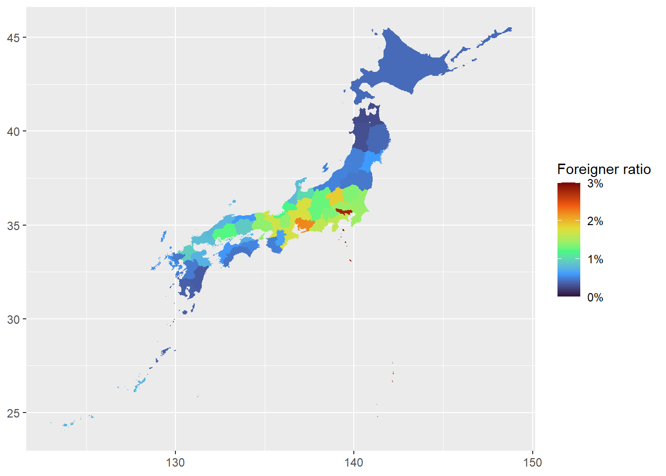
Using ggplot2’s geom_sf(), you can easily draw sf package geometries.
Using the sf package’s st_as_sf(), you can convert the map data provided by the maps/mapdata packages into an sf object. By converting the map data of Japan to sf, you can draw the map more intuitively than with the code above.
library(sf)

map_japan <- maps::map("japan",
                       plot = FALSE,
                       fill = TRUE) |>
  st_as_sf() |>
  rename(pref_name = ID) |>
  mutate(pref_name = str_to_title(pref_name))

map_japan |>
  left_join(foreigner_ratio_2015,
            by = join_by(pref_name)) |>
  ggplot(aes(fill = foreigner_ratio)) +
  geom_sf(color = "transparent") +
  scale_fill_viridis_c("Foreigner ratio",
                       limits = c(0, 0.03),
                       labels = scales::label_percent(),
                       option = "turbo")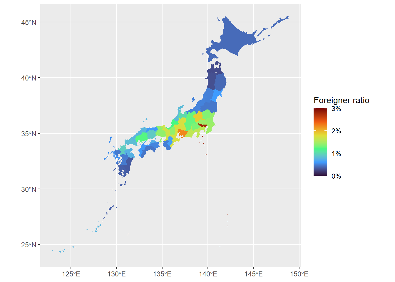
There is also the rnaturalearth package, which lets you obtain world map data.
To get a map by prefecture, you can call rnaturalearth’s ne_states("japan"). The output of ne_states("japan") is handy because it includes not only the English prefecture names but also the Japanese prefecture names.
map_japan <- rnaturalearth::ne_states("japan") |>
  as_tibble() |>
  st_as_sf() |>
  select(iso_3166_2, name_ja, name_en) |>
  arrange(iso_3166_2)
head(map_japan)When drawing a map of Japan, there are cases where you want to reposition the Ryukyu Islands and the Ogasawara Islands to the upper-left and lower-right of the map, respectively, so that the main Japanese archipelago can be drawn larger. I created jpmap to make it easy to lay out maps of Japan created with ggplot2 in this way.
jpmap has the following features.
jpmap::layout_japan(), which lets you produce a layout with the Ryukyu Islands and Ogasawara Islands repositioned
Note, however, that the scale of the repositioned Ryukyu Islands and Ogasawara Islands is not exact
You can hide the Ryukyu Islands and/or Ogasawara Islands by specifying ryukyu = FALSE or ogasawara = FALSE
jpmap::prefecture, which provides prefecture data including Japanese prefecture names and prefecture codes (based on rnaturalearth’s data)
pref_name) are spelled things like Hokkaidō rather than Hokkaido.By changing the map layout with jpmap::layout_japan(), it becomes easier to see trends by prefecture.
# pak::pak("UchidaMizuki/jpmap")
jpmap::prefecture
plot <- jpmap::prefecture |>
left_join(foreigner_ratio_2015 |>
select(!pref_name),
by = join_by(pref_code)) |>
ggplot(aes(fill = foreigner_ratio)) +
geom_sf(color = "transparent") +
scale_fill_viridis_c("Foreigner ratio",
limits = c(0, 0.03),
labels = scales::label_percent(),
option = "turbo")
jpmap::layout_japan(plot)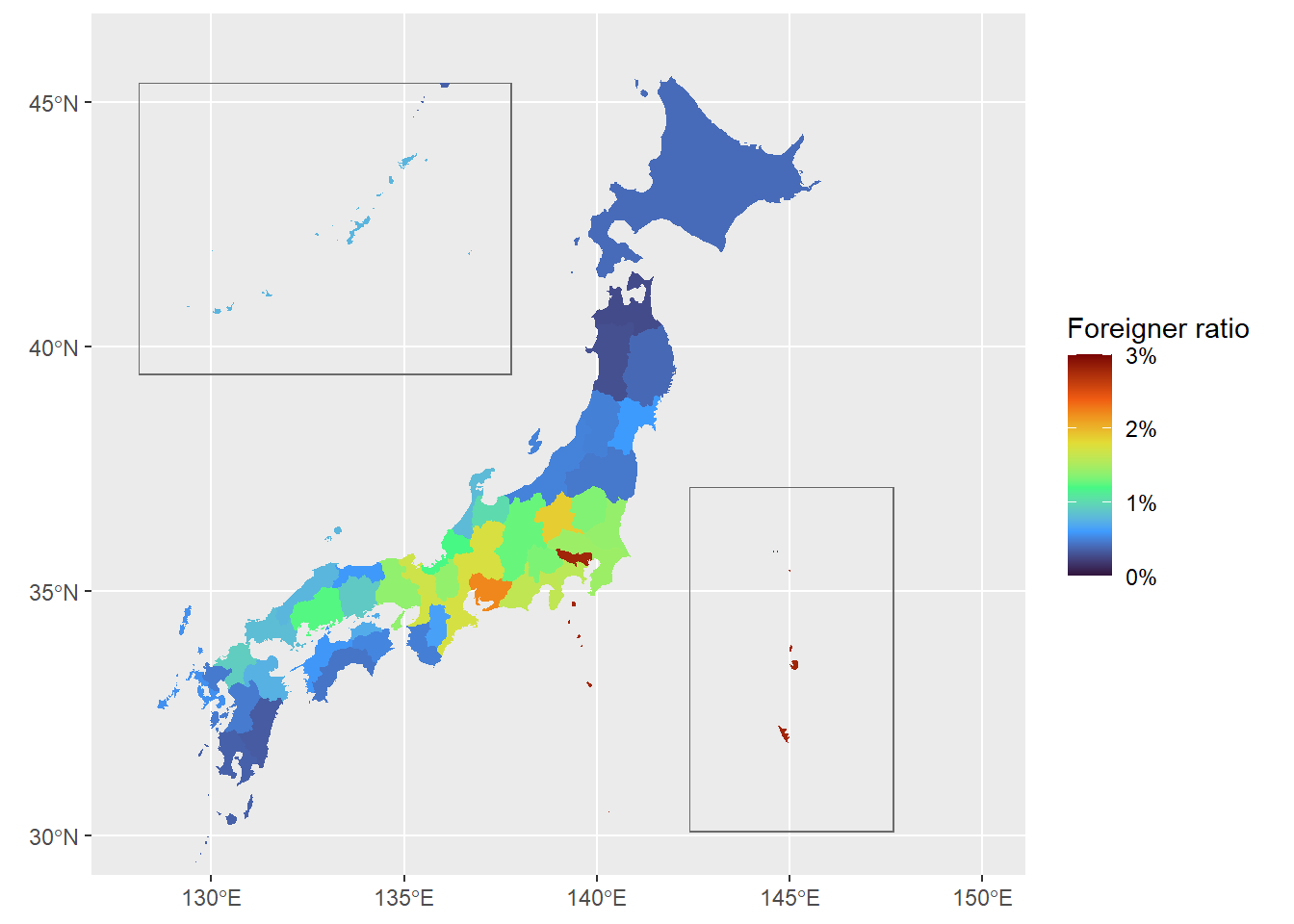
From the map of Japan showing the foreigner-population ratio by prefecture in 2015, we can see the following.
In 2015, the foreigner ratio was 3% or lower in every prefecture.
Tokyo has the highest foreigner ratio, and prefectures such as Aichi and Gunma also have relatively high foreigner ratios.
Here, I tried drawing a map of Japan using packages such as ggplot2.
As a result, I found that with R, you can easily draw a map of Japan without having to prepare the data yourself. I encourage you to try drawing various maps with ggplot2 as well!