library(tidyverse)
library(jpstat)Note: This article is translated from my Japanese article.
About this article
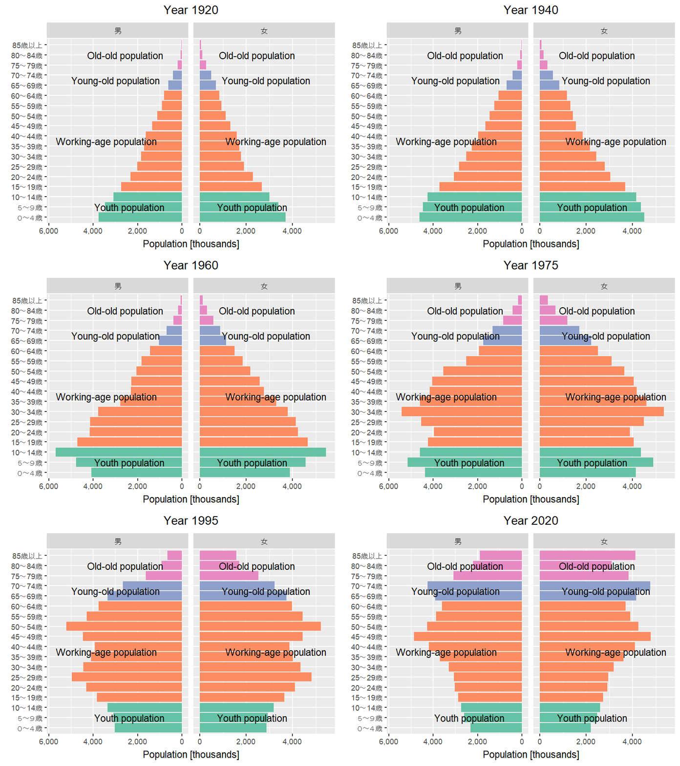
Referring to the population pyramid transition animation published by the National Institute of Population and Social Security Research (IPSS), I tried creating an animation like the one below using ggplot2 in R.
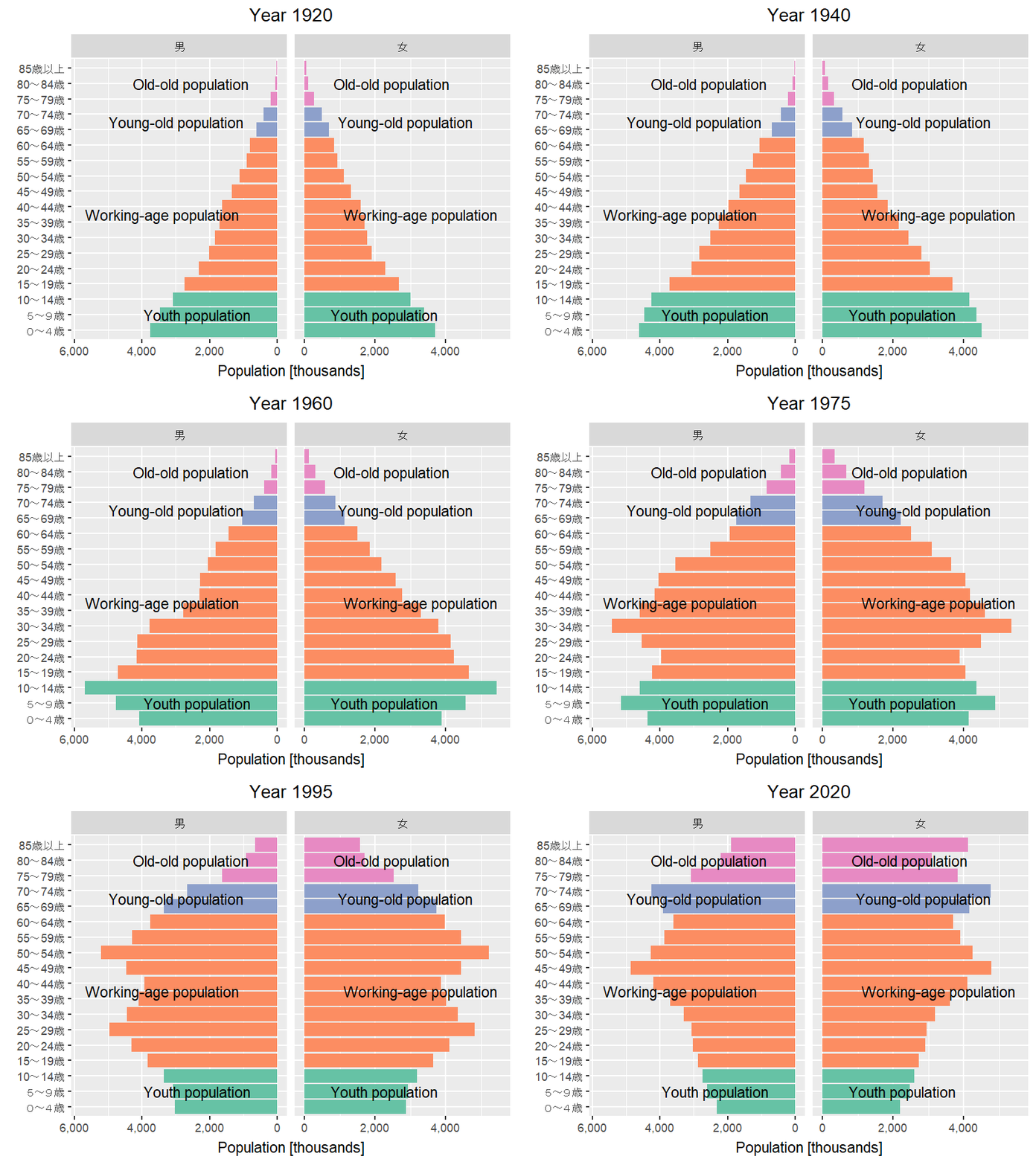
Getting time-series data from the Population Census
First, let’s get the time-series data on population by sex and 5-year age group from the Population Census, published on e-Stat, using R’s jpstat package.
To use the e-Stat API from the jpstat package, you need to obtain an application ID (appId).
# Replace this with your own appId
Sys.setenv(ESTAT_API_KEY = "Your appId")
census <- estat(statsDataId = "https://www.e-stat.go.jp/dbview?sid=0003410380")
pop <- census |>
activate(tab) |>
filter(name == "人口") |>
select() |>
# Extract sex
activate(cat01) |>
rekey("sex") |>
filter(name %in% c("男", "女")) |>
select(name) |>
# Extract age class
activate(cat02) |>
rekey("ageclass") |>
filter(str_detect(name, "^\\d+~\\d+歳$") |
name == "85歳以上" |
name == "110歳以上") |>
select(name) |>
# Extract year
activate(time) |>
rekey("year") |>
filter(str_detect(name, "^\\d+年$")) |>
select(name) |>
# Get e-Stat data
collect(n = "pop") |>
rename_with(~ .x |>
str_remove("_name$")) |>
mutate(sex = as_factor(sex),
year = parse_number(year),
# Get the minimum age for each age class
age_from = ageclass |>
str_extract("^\\d+") |>
stringi::stri_trans_nfkc() |>
as.integer(),
# Treat "85歳以上" as the highest age class
ageclass = case_when(age_from >= 85 ~ "85歳以上",
TRUE ~ ageclass) |>
as_factor(),
# Add age group
agegroup = case_when(between(age_from, 0, 10) ~ "Youth population",
between(age_from, 15, 60) ~ "Working-age population",
between(age_from, 65, 70) ~ "Young-old population",
age_from >= 75 ~ "Old-old population") |>
as_factor(),
pop = parse_number(pop)) |>
# Aggregate the "85歳以上" population
group_by(year, sex, ageclass, agegroup) |>
summarise(pop = sum(pop),
.groups = "drop")The total number of data is 796.knitr::kable(head(pop))| year | sex | ageclass | agegroup | pop |
|---|---|---|---|---|
| 1920 | 男 | 0~4歳 | Youth population | 3752627 |
| 1920 | 男 | 5~9歳 | Youth population | 3467156 |
| 1920 | 男 | 10~14歳 | Youth population | 3089225 |
| 1920 | 男 | 15~19歳 | Working-age population | 2749022 |
| 1920 | 男 | 20~24歳 | Working-age population | 2316479 |
| 1920 | 男 | 25~29歳 | Working-age population | 2008005 |
Creating the population pyramid animation
By using R’s gganimate package, you can turn a ggplot2 graph into an animation.
library(gganimate)Warning: package 'gganimate' was built under R version 4.6.1# Data for displaying age groups
agegroup <- pop |>
group_by(sex, agegroup) |>
summarise(ageclass = mean(as.integer(ageclass)),
.groups = "drop") |>
mutate(hjust = case_when(sex == "男" ~ 1.25,
sex == "女" ~ -0.25))
poppyramid <- pop |>
# Convert male population to negative values to create the population pyramid
mutate(pop = if_else(sex == "男", -pop, pop)) |>
ggplot(aes(ageclass, pop,
group = sex,
fill = agegroup)) +
geom_col(show.legend = FALSE) +
geom_text(data = agegroup,
aes(label = agegroup,
hjust = hjust),
y = 0) +
scale_x_discrete(NULL) +
scale_y_continuous("Population [thousands]",
# Convert labels to absolute values in thousands
labels = purrr::compose(scales::label_comma(scale = 1e-3), abs)) +
scale_fill_brewer(palette = "Set2") +
coord_flip() +
facet_wrap(~ sex,
scales = "free_x") +
labs(title = "Year {frame_time %/% 5 * 5}") +
theme(plot.title = element_text(hjust = 0.5)) +
# Convert to animation
transition_time(year)
# Change width and height
animate(poppyramid,
width = 800,
height = 600,
units = "px",
res = 150,
renderer = gifski_renderer())